Friday, May 7, 2010

ART 108 SPRING 2010

THANKS SARA!! ITS BEEN GREAT BEING IN YOUR CLASS!!!
GOOD LUCK TO YOU IN ALL YOU DO :)


MY FAVORITE ARTIST

organic cotton. cashmere. baby alpaca www.mormorrita.com

ONE OF MY FAVORITE ARTISTS EVER! MOR MOR RITA IS THE MOST BEAUTIFUL PALET OF SUBLE COLOR THAT YOU WILL EVER FIND. ALTHOUGH MOST OF THE ARTISTS PROFESSIONAL WORK IS IN TEXTILES RYAN ROCHE OF MOR MOR RITA IS A MULTI TALENTED DESIGNER. HER WORK INCLUDES A SUCCESSFUL CHILDRENS LINE AS WELL AS INTERIOR DESIGN WORK AND GARDEN LANDSCAPE. THIS ARTIST INSPIRES ME IN ALL THAT SHE CREATES AND I AM ALWAYS LOOKING TO SEE WHAT WILL BE THE NEWEST AND NEXT PROJECT SHE WILL WORKING ON.


SOAP/SPAM CARVING CONTEST

this is first and second place in our class soap carving contest. i was not able to get a photo of the winning spam sculpture, but im sure it was equally beautiful :)


INSTALLATION PROPOSAL

5 ideas:

*the transformation of the 1950's house wife vs. a woman living in 2010 shown through the display of kitchen accessories.

*the transformation of todays childhood to teenager experience shown through the eyes of a 17 year old herion adict. installation to include a range of idealized "childhood" toys and clothing as well as the addition of empty pill bottles, razor blades, filth and destruction.

*the study and viewing of one day in the life of a specific OCD issue. checking to see if door is locked, turning lights on or off, any kind of repetitive act. this could be interesting as a video installation.

*the human body in the begining, middle and then end of life stages. photography of specific body parts showing the different visual changes.

*idealized home in america including 2.5 kids, new cars in drive way and one dog and one cat. installation shown in the form of an architects plans and blue prints.


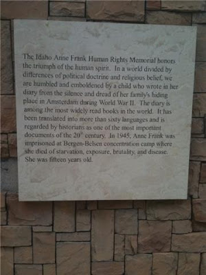
ANNE FRANK HUMAN RIGHTS MEMORIAL


1. describe what you see, including location (context) and physical space.
i was very suprised when i went to visit the ann frank memorial. i have driven by the huge rock ingraved "anne frank" so many times and thought that was the entire memorial sight. when i stepped aroung the corner and saw the beautiful garden and water feature it literally took my breath away. i felt the most intense emotion at the memorial and was very suprised that i felt so calming considering the space is located between two such busy streets.

2.describe the varying degrees of representation.
at the anne frank memorial site there were several different ways that the designers expressed themselves i saw water, concrete and iron work. there is audio interaction, where a story is told through the turning of a crank. the story continues to be told through written word that is displayed in a beautifully thoughtful manner that leads the viewer from one side of the space to the other. one of the most interesting displays was the marking of floor space. the designer has taken the exact square footage of the living space and scored the concrete so that we can all feel the restriction of annes daily experience. standing inside the boundrys of the concrete i realized that they probably had alot compared to some, however it was still so very little. it was an extremly emotional experience for me.

3.what are visual elements/principles that dominate in the memorial?
water, the beauty of nature, repatition of visual elements in the form of quotation, beautiful life size iron work of anne looking out a window.

4.is this memorial sight specific?
no it is not sight specific. i could not see any specific as to why that sight was chosen. i do think the site works very well for the subject matter. it feels like a very safe little secret garden.

5.who created, designed and funded the memorial?
from what i could see there are many people in the community that have contributed to the memorial and their names are located throughout the installment on different benches and plaques. the designer of the project was kurt karst of idaho falls. the designer greg stone is responsible for the beautiful statue of anne frank.

6.what materials/media were used to create this memorial?
a combination of natural elements like water, stone, and native local plants- with a message of hope in humanity.

7.how does the text/word elements function?
i felt that the text lead me around the memorial. the text was very bold among the nutrual stone and natural environment. the text had a strong emotion message and felt powerful and hopeful

8.reflecting on your answers to the previous questions, what do you think was the intended meaning/function? explain what is communicated.
the legacy that anne frank has left for man kind is very present here. the mission of the idaho human rights education center is to promote respect for human dignity and diversity through education and foster our individual responsibility to work for justice and piece.

9.in your opinion, how successful is this memorial?
i felt so emotional while at the memorial. i have never felt that way at any other memorial. for that reason alone i feel like the designer was successful. the visual aspects of the design is so pleasing, calming and genuine. every part of this memorial was successful to me.


Saturday, May 1, 2010

ON THE RIGHTS OF MOLOTOV MAN

In the article “On the Rights of Molotov Man” I found myself having a very strong reaction and opinion in favor of the artist Joy Garnett. Starting with the Question posed, “does the author of a documentary photograph- a document who’s mission is, in part, to provide the public with a record of events of social and historical value- have the right to control the content of this document for all time?” I would like to answer that question with a question of my own. What art would we be without today if the art community only allowed “original” works having absolutely no resemblance or similarities to anything else in the world? Every artist, every writer every person who creates reflects their inspirations in their own works. For example the most obvious example of this would be Andy Warhol. His soup cans and Marilyn Monroe images are classic examples of and artist using someone else’s image as total inspiration for his own work.

While I wanted to sympathize with Susan Meiselas’ feeling as an artist, I personally could not get on board. While the idea of decontextualization of content is a valid concern, I don’t agree with the stifling of art or personal expression and I cannot believe the militant in the photograph would oppose the publicity of his cause. I think the Molotov Man probably appreciates the fact that the issues he felt and feels so passionately about has remained present in current works even thought is battle was being fought so many years ago.

"LIKE A MUSEUM"

journal assignment:
take three artists from given list and research

chosen artists:
ann hamilton
annette messager
christian boltanski

CHRISTIAN BOLTANSKI

Boltanski was born in Paris to a Jewish father of Ukrainian heritage and a Corsican mother. He lives and works in Malakoff and is married to the artist Annette Messager, with whom he sometimes collaborates.

His artistic work is haunted by the problems of death, memory and loss; he often seeks to memorialize the anonymous and those who have disappeared.

In his preliminary years, Boltanski's paintings were concerned primarily with themes of historical significance. However, by the 1970s, Boltanski removed himself from the painting arena and began his quest for remnants of his own past through selected artworks. These artworks led Boltanski to question the substance he had used when creating his own artworks. However, this introspectivism supplied him with the motive for other artworks in which non-truths and the realisation of fundamental truths converged. Boltanski reconstructed his own youth in this method. In doing so, Boltanski used a vast spectrum of media. For example, film, performance, photography and video. It is interesting to note that Boltanski maintained this vision and direction without focusing on the obvious contradiction of his self-understanding as a painter.

Moreover, the combination of varied media is a fundamental part of the spatial dimension which has been the focus of Boltanski's work since the mid-1980s.


Quotations

I began to work as an artist when I began to be an adult, when I understood that my childhood was finished, and was dead. I think we all have somebody who is dead inside of us. A dead child. I remember the Little Christian that is dead inside me.

—Christian Boltanski, Tate Magazine Issue 2
I stopped going to school at about age 12, and I was very crazy, and I stayed at home. One day I made a little object in plasticine and my parents said it was good. So I started to make more, and to make drawings, and I began to make large paintings in my bedroom.
—Christian Boltanski, Tate Magazine Issue 2
We are all so complicated, and then we die. We are a subject one day, with our vanities, our loves, our worries, and then one day, abruptly, we become nothing but an object, an absolutely disgusting pile of shit. We pass very quickly from one stage to the next. It's very bizarre. It will happen to all of us, and fairly soon too. We become an object you can handle like a stone, but a stone that was someone.
—Christian Boltanski
( information taken from http://en.wikipedia.org/wiki/Christian_Boltanski)


ANNETTE MESSAGER

Annette Messager is a French artist who was born in 1943. She is known mainly for her installation work which often incorporates photographs, prints and drawings, and various materials.[1] Messager has exhibited and published her work extensively. She is the partner of artist Christian Boltanski.

Messager attended the École des Arts Décoratifs in Paris, France but was eventually asked to leave because she spent her time at museums and movie theaters instead of going to school.[2]

In 2005 her work was featured in the French Pavilion of the Venice Biennale, where she won the Golden Lion for her Pinocchio-inspired installation that transformed the French pavilion into a casino. some of her most famous work is her exhibition the messengers, which showcases a bunch of dead birds in sweaters which she knit herself, some of the birds heads were replaced by stuffed animal heads[3] She had a solo exhibition at the Centre Georges Pompidou in 2007.

(information found at http://en.wikipedia.org/wiki/Annette_Messager)


ANN HAMILTON:

Born in 1956 in Lima, Ohio Ann Hamilton trained in textile design at the University of Kansas. Ann later received an MFA from Yale University. With a degree in sculpture, textiles and fabric have been extremely important to her work, which includes installations, photographs, videos, performances, and objects. Following graduation she made “Toothpick Suit,” for which she layered thousands of toothpicks in porcupine fashion along a suit of clothes. Ann then wore the design and photographed. Sensual installations usually included evocative soundtracks with cloth, filmed footage, organic material, and objects such as tables. She has also been interested in verbal and written language and sees the two as related and interchangeable. Hamilton has experimented with exchanging one sense organ for another—the mouth and fingers, become like an eye with the addition of miniature pinhole cameras. As the 1999 American representative at the Venice Biennale, her instalation of slavery and oppression in American used walls embossed with Braille. The embossed Braille caught a dazzling red powder as it slid down from above, literally making language visible. After teaching at the University of California at Santa Barbara from 1985 to 1991, she returned to Ohio, where she lives and works.

(information found at http://www.pbs.org/art21/artists/hamilton/index.html)


THIRD ASSIGNMENT

the third assignment of the semester is to create a book out of folded paper. i quickly knew what my project was going to be about. following are only a few images that i used for insperation. i did not look to others for much insperation during this assignment because it was such a personal subject matter that i chose to work with. i knew from the beginning what the finished work was going to look like and feel like. following the other artists is my artist statement and finished work.

fold

1 [fohld]
–verb (used with object)
1. to bend (cloth, paper, etc.) over upon itself.


Kate Pullen

RANDOM ARTISTS


SEWN SIGNATURES BY KATER'S ART

simply beautiful. the clean white of the water color paper is so beautiful and delicate. i feel like the absence of color and design makes such a statement in this peice. im inspired by the minimalism.